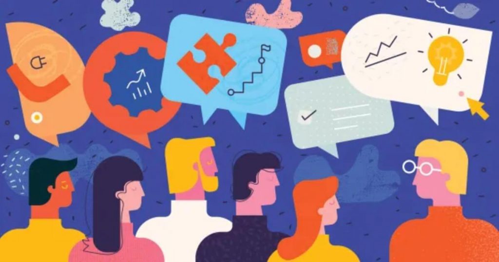
Table of Contents
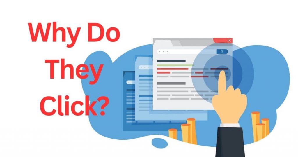
You’ve built a great website, but visitors just aren’t clicking. They scroll, they look… and then they leave. No sign-ups, no purchases, no engagement. It’s frustrating, right? You know your product or content is valuable—so why aren’t people taking action?
Every missed click is a missed opportunity. Think about it—how many potential customers have slipped away because your buttons weren’t clear, your page was too slow, or your design just didn’t feel right? Bad user experience (UX) kills conversions, and even small mistakes can cost you big.
The good news? Science has cracked the code on what makes people click. Tiny tweaks to your design, wording, and layout can turn passive visitors into eager customers. In this post, you’ll discover simple, proven UX secrets that boost clicks—no guesswork, no jargon, just real results. Ready to turn those missed chances into conversions? Let’s dive in.
Why People Click (and Why They Don’t)
People click when something grabs their attention and feels worth their time. But if a page looks confusing, overwhelming, or untrustworthy, they’ll leave without a second thought. Our brains make snap decisions—within seconds, we judge whether a site is helpful or a waste of time. Clear headlines, strong visuals, and a logical layout keep users engaged. On the other hand, slow loading times, too many pop-ups, or unclear next steps make them bounce. Understanding these triggers helps you design a site that guides visitors toward action instead of pushing them away.

The Magic of First Impressions: Design That Pulls You In
Buttons are the gatekeepers of conversions—small changes in their design can make a huge difference. The right color, size, and wording can turn a “maybe” into a “yes.” For example, red creates urgency, while green feels safe and positive. Words matter too—”Get Started Free” works better than “Submit” because it’s clearer and more exciting. Even placement plays a role: buttons above the fold (visible without scrolling) get more clicks. Testing different versions helps you find what works best. When buttons look clickable and promise real value, people can’t resist pressing them.
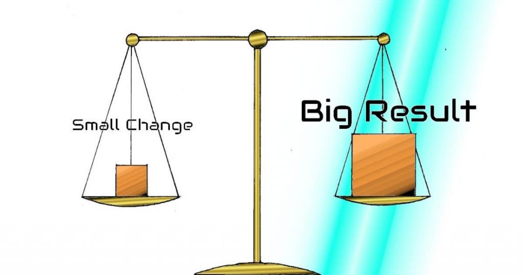
Button Psychology: How Tiny Changes Create Big Results
A cluttered page overwhelms visitors—too many choices, and they’ll do nothing at all. Simplifying your design removes distractions and guides users toward the action you want. Cut unnecessary text, use plenty of white space, and highlight only the most important elements. A clean layout makes buttons stand out, improves readability, and helps users move smoothly through your site. When everything has a clear purpose, people feel more confident clicking. Less noise means more focus, and more focus means more conversions. Keep it simple, and watch your clicks grow.
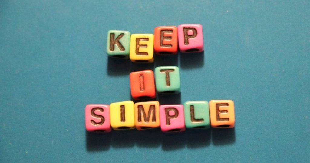
The Art of Keeping It Simple (Less Clutter, More Clicks)
Think about walking into a messy room – it’s overwhelming and hard to focus. The same thing happens when users visit a cluttered website. Too many buttons, pop-ups, and competing messages make people freeze instead of click. The solution? Strip it down. Use clear headings, plenty of white space, and one obvious call-to-action per section. When you remove distractions, users naturally gravitate toward the buttons and links you want them to click. Simple doesn’t mean boring – it means creating a smooth path that guides visitors exactly where you want them to go.
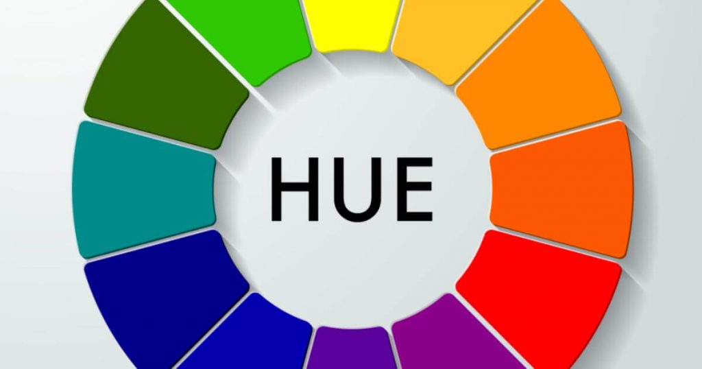
Colors That Convert: Picking the Right Hues for Action
Colors do more than make your site look pretty – they trigger emotions and actions. Red screams urgency (perfect for “Limited Time Offer!”), while blue builds trust (great for “Sign Up Securely”). The key is contrast: a bright button on a neutral background practically begs to be clicked. But remember, colors mean different things in different cultures – what works for one audience might backfire for another. Test different color combos to see what drives the most clicks. When you match colors to the emotions you want to evoke, you turn casual browsers into eager customers.
Words That Work: How to Write for Clicks, Not Just Reads
“Click Here” is the digital equivalent of a shrug – it gives users no reason to care. Powerful button text creates curiosity or highlights benefits. Compare “Download” with “Get Your Free Guide Now” – which one would you click? Action verbs (“Start,” “Discover,” “Claim”) work better than passive words. Keep it short (under 5 words is ideal) and specific about what happens next. The best click-worthy copy feels like a natural next step, not a sales pitch. When your words align with what users want, they’ll click without hesitation.
Speed Matters: Why Fast Load Times Keep Users Happy
Waiting for a slow website feels like watching paint dry – most people won’t bother. If your page takes more than 3 seconds to load, you’re already losing visitors. Every extra second increases frustration and kills conversions. Optimize images, streamline code, and use caching to speed things up. Mobile users are especially impatient – they expect sites to load instantly. Fast pages don’t just keep users happy; they also rank higher in search results. When your site snaps onto the screen quickly, people stay longer, click more, and actually see what you’re offering.
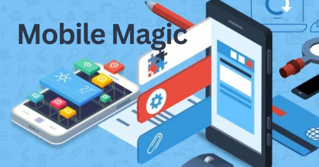
Mobile Magic: Designing for Thumbs, Not Just Mice
Desktop designs often fail on mobile because fingers aren’t as precise as mouse pointers. Buttons need to be bigger (at least 48×48 pixels), with plenty of space between them to prevent mis-taps. Put key actions where thumbs naturally rest – the bottom half of the screen is prime real estate. Simplify menus, enlarge text, and make forms easy to fill out on small keyboards. A mobile-friendly site isn’t just scaled down – it’s completely rethought for how people actually use phones. When your design works with thumbs instead of against them, mobile users will click with confidence.
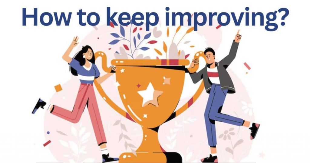
Testing, Tweaking, and Winning: How to Keep Improving
What works today might not work tomorrow – that’s why testing is your secret weapon. Try different button colors, headlines, or layouts to see what gets more clicks. Tools like A/B testing let you compare versions and pick the winner. But don’t stop at one test – small improvements add up over time. Track your results, listen to user feedback, and stay curious. The best websites aren’t built overnight; they evolve through constant tweaking. When you make testing a habit, you’ll keep finding new ways to boost conversions and stay ahead of the competition.
Final Thoughts
Great UX isn’t about flashy design—it’s about understanding how people think and what makes them click. Small, science-backed tweaks to your buttons, layout, colors, and words can dramatically boost conversions without a complete redesign. The key? Test everything. What works for one audience might not work for another, so keep experimenting and refining.
Start with one change today—whether it’s simplifying your homepage, speeding up load times, or rewriting a call-to-action—and track the difference it makes. Over time, these optimizations compound, turning passive visitors into engaged customers.
Got a tricky UX challenge or want help implementing these strategies? Reach out at info@adrian-portfolio.com. Now go make those clicks count!
10 FAQs Based on the Blog
1. What’s the #1 mistake that kills conversions?
Cluttered designs. Too many choices overwhelm visitors—simplify your layout and highlight one clear call-to-action per section.
2. Which button color converts best?
It depends on your audience and context, but high-contrast colors (like red for urgency or green for safety) often outperform neutral tones. Always A/B test!
3. How long should my headline be?
Aim for 6–12 words. Clear, benefit-driven headlines (e.g., “Get 50% Off Today Only”) outperform vague ones.
4. Why does page speed matter for conversions?
53% of mobile users abandon sites that take longer than 3 seconds to load. Faster pages = happier visitors = more clicks.
5. What’s the best call-to-action wording?
Use action verbs + benefits: “Start My Free Trial” beats “Submit.” Keep it under 5 words.
6. How big should mobile buttons be?
At least 48×48 pixels with spacing to prevent mis-taps. Thumbs aren’t as precise as mouse cursors!
7. Should I use pop-ups to boost conversions?
Carefully! Pop-ups work if they’re relevant and timed well (e.g., exit-intent offers), but too many annoy users.
8. How often should I A/B test my site?
Constantly. Even small tweaks (like button shape or form length) can lift conversions. Test one element at a time.
9. Why do simpler designs convert better?
Our brains prefer clear paths. Fewer distractions = more focus on your key action (e.g., “Buy Now”).
10. How can I tell if my UX needs work?
Use tools like Hotjar to watch user recordings, or check bounce rates—if over 70%, your UX likely has issues.
Ready to optimize? Pick one tip to implement today and measure the results!

I’m a web developer with hands-on experience building and managing WordPress-based websites. My portfolio features real-world projects in recruitment UX, Arduino systems, and Python development, all focused on clean, user-centred design.